I am co-curator with Melissa Warp of the exhibition DesignHer: Works by Contemporary Women Graphic Designers at The Eleanor D. Wilson Museum September 30 – December 12, 2021 at Hollins University in Roanoke Virginia. DesignHer is an exhibition of contemporary graphic design focusing on 19 women practitioners. If spoken, the H in the show’s title’s is silent, representative of how the story of design and the story of women in design are the same. It also symbolizes that for much of design’s history, the contributions of women have been largely unheard. A primary theme within the show is how women have been at the forefront of defining and challenging the conceptions of design; also, how design exists, often simultaneously, as culture’s most public and private expression. Participants range from younger artists building a reputation through internationally-renowned leaders in the discipline. From individually crafted objects to mass media campaigns, speaks about design writ large through the voices of women speaking design to our culture. (In photo: installed posters by Paula Scher)
Tag: Marian Bantjes
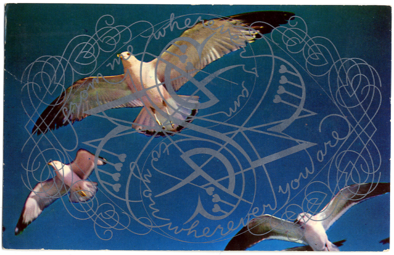
Marian Bantjes’ 2012 valentine

For her valentines this year, Marian Bantjes printed her original vector artwork over used vintage postcards. You can read and see more at her website. Thanks as always to Marian for the gift!

2011 Greetings


Though received in timely manners, I’m late to acknowledge and thank Marian Bantjes and UnderConsideration (the professional guise of Bryony Gomez-Palacio and Armin Vit) for their especially spiffy holiday cards. As there’s a “volume” reference in the latter, I’m particularly charmed by that one. (Click ahead to see both!)
I Proclaim You Cultish

For Eye magazine’s summer 2009 “Agenda” section, Steven Heller produced another cult alert. By titling the piece “Cult of the Squiggly,” he obviously meant to invoke his earlier, infamous “Cult of the Ugly” essay. It’s a fair reference: both articles decry and advocate suppression of anti-Modern graphic design phenomena Heller deems disadvantageous to the field. However, the two articles raise more questions about the state of graphic design criticism within the field than it does of current practice. The main query continues to be: is there a criticism at all?
“Squiggly” details a new threat to emerge—or, more accurately, an old threat to reemerge—in the decade plus since “Ugly”: ornamentation. According to Heller, it’s “multiplying and spreading in nonsensical uses to a terrifying degree.” Weedy graphics are proliferating everywhere. The situation is expressed as dire. (Since reading the article, I’ve been keeping close watch on the STOP sign on my street corner…just hoping.)
The solution is to “prune” the “invasive squigglies,” says Heller, “…when ornament is profligate, design is made trivial.” The exact mechanism through which graphic design will be trivialized—like how gay marriage will corrupt the straight—is never detailed. Nor is the nature of the “pruning” that needs to occur. Fines? Guerilla incursions at printers? Crashing the servers of clip art sites?
As criticism, Heller’s directive is anodyne and undeserving of special notice. Surely, any graphic element used indiscriminately is contraindicated. There must be more to it than that, right?
Actually, no. Why the Cult of the Squigglies is more pernicious than, say, the Cult of Hallowed Helvetica—to choose just one other contemporary graphic overindulgence—goes unexplained. In fact, Heller’s text could be used to make a case for the Squigglies restoring some needed balance to design. Ornamentation “…likely…is a reaction to the perpetual dominance of sterile Modernism.” Isn’t that reaction a good thing?
Not unless the article is meant as yet another call to arms for Modernists to reassert their primacy. Though the modifier “sterile” is used, we’ve yet to see a “Cult of the Moderns” from Heller, so we can assume it’s the preferred default state of design.
Certainly designers are being called to action (or inaction, by cutting out the vines and twigs) but with no clear directives on how and when to act. Beyond, of course, stop it. If we accept Heller’s premise, how are we to know the point at which ornament becomes abuse? Obviously, many art directors and designers don’t (what went wrong?) but are given no explicit guide on where the dividing twine is.
Evidently, we’re to extrapolate from example. The article offers three (3) positive examples of ornamentation and two (2) negative. From the affirmatives, we can only be certain we’re safe if we hire the exemplars. This is good news for Marian Bantjes, whose ability Heller describes as “unworldly.” But is Heller certifying that all of Bantjes’ work is appropriately ornamental and extraterrestrial? (Much as I admire her work, I wouldn’t.) Is the problem too much ornamentation or not enough of sufficient quality?
The article hops around on this point and its definition of ornamentation. One of the cited bad apples—the book cover of Alex Ross’ The Rest Is Noise—barely shows some curl. Its few stray wavy bits (ampersands on a bender) lead to a definition of ornamentation as “any curvilinear embellishment.” No wonder Heller feels choked. But the example only adds to the confusion the article engenders with every statement.
Maybe the vagueness overall is deliberate—the article may actually be a(nother) promotion for Heller’s ubiquitous commentary. He knows what he means, even if we don’t. There’s nothing wrong with designers promoting themselves and their causes but if there’s a gnarly entanglement in the field it’s how self-aggrandizement wraps around and through most commentary by renowned practitioners.
“Squigglies” displays an ongoing aspect of Heller’s articles: the gratuitous mention of the school at which he works—the School of Visual Arts. Here, Heller stretches one of the definitions of ornamentation (“lettering made of branches and bark”) to shoehorn in a shout-out for a Stefan Sagmeister SVA promotional poster. Pronounced as “profound,” the poster in question is better described as a charming Photoshop exercise whose imagery distracts attention from the text’s awkwardly phrased banality.
What is of more concern with Heller’s SVA association is with its graduate program in design criticism. Is this article an example of the rigor he brings to the program? If so, the output can be counted on to be more celebratory than investigative of design activity. If a student were to submit “Squiggly” to me as a paper, I’d return it with a demand for answers to some of the questions above. If the writer were unable or unwilling to provide those clarifications, the paper shouldn’t exist.
I’d also hope that a magazine editor would demand the same answers before publication. However, such exactitude is probably considered the realm of scholarship, not graphic design punditry. Most design writers and practitioners have little patience for the detail scholarship demands. Popularizations are preferred. Proclamation based upon reputation trumps criticism based on explication every time. Expressed here is graphic design’s most perilous, perpetual Cult: personality (“The Daily Heller”).
When it comes to the Squigglies, they can fend for themselves. Even were I to consider them a special menace, Heller’s own article recommends (unintentionally) that we can just wait them out. As ornamentation is a response to austerity, so the wheel will turn again. We can hope that graphic design practice rises above such predictable, empty reactivity. We should also ask the same of its literature.
Note: this was originally written to be a response to an anticipated (but not realized) posting of the Heller essay at the Eye blog. Apologies and shout-out to Denise Gonzales Crisp for the title of this post.

