Process Music in Eye 104

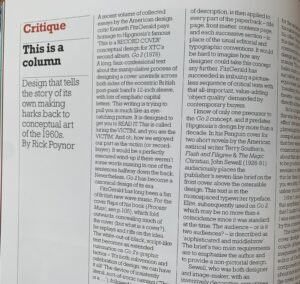
photo of book review in Eye magazine

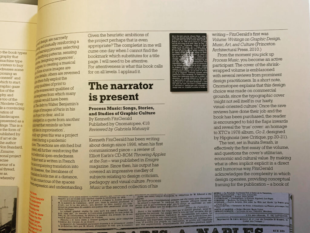
My recent book Process Music is reviewed by Gabriela Matuszyk in the latest issue of Eye magazine. Matuszyk says “The book does a great job in containing core design issues, themes, figures and objects by making them accessible through humour, observational storytelling and self-referential framing. For me, Process Music was energising, a reminder that the process of reading and writing is fundamental to self-reflection, criticism and designing.”

In addition, Rick Poynor discusses the book’s cover concept in context with other self-referential art and design works, in his Critique article, “This is a column.” Of the book’s cover/interior concept, Poynor says, “It would be hard to imagine how any designer could take this concept any further. FitzGerald has succeeded in imbuing a pictureless sequence of critical texts with that all-important, value-adding ‘object quality’ demanded by contemporary buyers.”

photo of Critique article in Eye 104

BB King

If Barney Bubbles was punctuation, he’d be an interrobang. He seemed incapable of the straightforward, singular expression. Everything divulged layers. His work and practice were a gestalt of contradictions and oppositions. Unpacked, it opened like a graphic Big Bang. Even a personal scribble from Bubbles exhibits minutiae that provoke a close reading. Why would it be any different from the rest of his oeuvre?

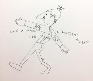
In his forward for Paul Gorman’s Reasons to Be Cheerful, designer Malcolm Garrett describes a message left for him by Bubbles, which included a rare self-portrait. “I SEE A VISION,” it read, “I SEE A ‘MODERN’ WORLD.” Crossing at chest level—ducking under the upraised left arm, floating over the extended right—the text precedes then trails after the sketchy figure. Even for a handwritten note, there’s typographic play: “WORLD” bends slightly, distinct from the rest of the text, the W hovering sideways above the O. “I SEE” repeats. Is it a stutter? Change of mind mid-thought?

The Bubbles caricature is moving away from the viewer, arms spread wide, fingers splayed. He might be maintaining balance as he confidently strides, left foot forward, right angled back, across an invisible tightrope or baseline. He could also be closing in to embrace someone off stage. Or be strutting. Or dancing.

There’s his signature schnoz, punctuated with a triangle and circle to form (according to Garrett) “Bauhaus nostrils.” Bubbles may not be seeing a “modern” world but smelling it, and liking the aroma. His mouth is described with pointed, puckered lips that betray no particular emotion or action. He could be silent, speaking, or singing.

The character is dressed in a geometric shirt or sweater, adorned with Charlie Brown-like zig zags at the elbows. Double-lined angles meet in the center of his back. Below, a curve of buttock is described to suggest snug-fitting trousers. Though likely dashed off, he still captures the detail of fabric bunched behind the bent right kneecap.

Bubbles deftly crafted an irreverent and expressive image of himself. Certain details stand out for their incongruency, complicating the reading. Springing from the top of his head, there’s what appears to be an unruly tuft of hair. He neglects to differentiate a shoe for the figure’s right foot as he does for the left.

With Bubbles, the game is always afoot, so intention and accident vie for cause. Usually, defects are revealed as effects. Bubbles’ work wasn’t so much designed as plotted, like a novel. The larger the seeming flaw—the “misprinting” of the This Years Model sleeve or the built in the scuff marks on Get Happy!!—the more purposeful he was.

Constantly manipulating aspects of identity, his penned persona is leading a double life. That spiky skull sprout isn’t just a coif, it’s a gimcrack crown. And that undivided ankle shows him to be wearing a costume—that of a jester. Yet again, Barney Bubbles has purposefully blended high and low, this time with him in the starring role. He’s his subject and Lord. The Fool King, or King Fool.

I see a “design” world conjured and ruled by Bubbles, the jester sovereign. He needed to create so prolifically, compulsively, in order to people that world. Its inhabitants were anthropomorphized combs, matches, handprints, paint splatters, typography, geometry, studio detritus.

He was a rare designer whose entire output—every ad, every sigil, every sleeve, every sticker—deserves delectation and preservation. Gorman’s monograph is a worthy document but doesn’t map the entirety of Bubbles’ domain.
He relentlessly churned out design artifacts: album packages, single bags, ads, buttons, stickers, posters, programs, and occasional books. Alongside these he crafted inventive videos, furniture, paintings, collages, sculpture. It was more than being prolific out of necessity, pushed by the breakneck pace of his primary clients. Its politics were a tad on the anarchistic side, though virulently antifascist.

Some designs were part of a wider system. A single sleeve might continue the layout aspects of the album it was drawn from—e.g. the single bag for “(I Don’t Want to Go to) Chelsea” and This Years Model—but this was an exception in Bubbles’ work. He seemed to regard it as slothful to extend an identity into other artifacts.

And within his album packages, there regularly were inner sleeves, bespoke labels (which could vary in design from one side to the other), postcards, posters, stickers. Many albums sported unique logos, or had the many variations for Stiff and F Beat. Bubbles also had his hand in illustrations and lettering—frequently wielding brush or stamp kit to create text. He should have been paid by the piece.

Bubbles production of countless supplementary, extraneous material was a hallmark of his profligacy. Within them, he didn’t simply rehash ideas, he developed themes across projects and media. Some sleeves contained more than one.

There was uncanny portrait Barney (Cycledelic, This Years Model, all Nick Lowe albums, The Future Now), painterly Barney (which includes most early works, Seconds of Pleasure, Imperial Bedroom, Compass Point), domestic kitsch Barney (Armed Forces front cover, Mad About the Wrong Boy), surreal saga Barney (25 Years On, Be Stiff EP, Frogs, Sprouts, Clogs and Krauts, Speak and Spell), quoting Barney (Almost Blue, Life’s a Riot with Spy vs. Spy), music vernacular Barney (Get Happy!!, A Case of the Shakes, Music on Both Sides), meta Barney (This Years Model, Do It Yourself). Broadening out to his overall logo designs, one theme emerges, that might best be described as regalia.

In his last years, Bubbles’ design for music increasingly referred back to the pre-1960s era of small, independent record labels catering to jazz, blues, R&B, and early rock and roll. It was a time when myriad upstart companies opened all over the U.S. that catered to local artists deemed problematic by the majors. (England’s smaller market was dominated more by their indigenous majors and so didn’t see the same flowering of labels until the punk/new wave era).

Bubbles’ designs mimicked the visual accents of these labels with often geometry-based graphics featuring demonstrative type in keeping with overall commercial packaging. Only occasionally did Bubbles pointedly quote a well-known indie source. Typographically mirroring the album Midnight Blue by Kenny Burrell (1963) on the famed independent jazz label Blue Note for Elvis Costello and the Attractions’ Almost Blue (1981) was Bubbles indulging in a double graphic pun. (A more slavish imitation was issued a few years later with Joe Jackson’s Body and Soul (1984) paying homage to 1957’s Sonny Rollins, Vol. 2.) Reid Miles’ expressive typography was a regular go-to template for numerous other sleeve designs.

Looking to the U.S. for popular music inspiration was an established sightline. Emerging from skiffle, British rock and roll owes its existence to American expressions. Even groups such as Fairport Convention, which drew from and electrified British folk songs, were inspired by the Byrds.

The dominant, declared evocation for British bands was blues and R&B. Groups like the Beatles and the Rolling Stones celebrated African-American artists (literally) ghettoized in the U.S. In their native country, these performers could only be found on small labels often named Regal, Imperial, Duke and King. Chess Records (originally called Aristocrat)—a major among the minors with a roster including Chuck Berry, Bo Diddley, Howlin’ Wolf and Muddy Waters—contained all of the nobility. (It was, of course, named after its founding brothers).

The U.S. embraced the symbolism of royalty to ennoble its musicians. Representational democracy is all that but being the President of Rock ‘n’ Roll doesn’t confer much glory. Maybe a Sinatra can carry “Chairman of the Board” and make it work. Senator of the Blues? Please. Elvis was the King. Aretha Franklin the Queen of Soul. And so on to Prince.

In a small irony, when Stiff Records released Mil Gracias A Todos Nuestros Amigos by Tex-Mex master Joe “King” Carrasco and the Crowns (1980), it didn’t come in a Bubbles sleeve, but was outsourced to Chris “C-More-Tone” Morton.

As Bubbles overall turned to referencing historic music graphics, regalia surfaced as a theme in his logo work. Alongside toggling between a couple of typography-based logos for F Beat, Bubbles established a three-pointed crown as the sole object-based mark. Perversely, he didn’t use it for the aptly-named Imperial Bedroom (1982) (or IbMePdErRoIoAmL, as Bubbles would set it), his last produced sleeve design for Costello. This was likely due to the crown’s appearance as logo on Trust (1980), two albums previously. By the time Costello got to King of America, Bubbles had abdicated from life.

Bubbles introduced a new theme with Get Happy!!—inhabiting album design’s past. Elvis Costello’s 1980 release marked his definitive break from a “brittle” new wave sound to adopting an overt soul and R&B template. Bubbles echoed this in his throwback design which fused day-glo new wave colors with a high contrast Reid Miles type vibe. Bubbles physically reinforces the retro move with partial lamination and the faux scuff marks (on the F Beat version).

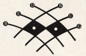
(Another dated reference is my suspicion that the sleeve may be a sham 3D image. According to Tom Pogson, his cover painting for Armed Forces was intended to be 3D. The idea may have slipped one release. The possibility is raised by the curious hues of the intersecting parallelograms on front and back. Also, the mysterious “bug” placed in the top corners front and back of the sleeve has a prominent “3” in its center, overlapping three sets of hypnotic concentric circles. The shape at the base of the “3” resembles a cap “D” with a pointed tail. A test viewing with 3D glasses was unsatisfying.)

Bubbles was as versed and discerning about the history of album graphics as he was in art. In addition to Reid Miles, Bubbles channeled record design pioneer Alex Steinweiss. Mostly, he evinced the music graphics “vernacular” (scare quotes used as they were performed by trained but usually uncredited professionals) prior to the 1960s, when his deliberate anonymity was the professional standard.  

This theme didn’t dominate and was applied to other releases that invoked rock and country roots music. It generated a studied timelessness in Bubbles’ sleeve work, different in nature with his other pastiche motifs. Evoking fine art and album graphics dislocated Bubbles’ work from its specific date of manufacture.

The generalized reference to past album graphic styles replaced the overt quoting of high art sources. This is most evident in the transition from Armed Forces (actually, an amalgam of all of Bubbles’ themes) to Get Happy!!

Overall, with the entirety of his work, Bubbles was composing his own undeclared visual Lipstick Traces, drawing his own connections between music, art and design across history. The resulting diagram was like a spirographed circle. Bubbles wasn’t at the center, he was throughout.

That this theme came late and last in Bubbles’ career gives it a special poignancy, though there’s no evidence it held any for him. As noted, it was likely a pragmatic conceptual move, reinforcing and resonating with what was placed in the grooves. It was self-referential but reflexivity wasn’t new for Bubbles. It was upon returning to sleeve design at Stiff that a self-consciousness entered his work. The process of design and its artificiality became a constant, overarching subject.

His self-consciousness also manifested in questioning his relevance as a sleeve designer. As early as 1981, in his lone printed interview, he lamented being “staid and boring.” “I’ve got to get out,” he said, “It’s time for me to go.” Two years after the publication of that interview, Bubbles went.

I see a vision of a “post-modern” world where Barney Bubbles stuck it out longer. Maybe he’d still be with us even now, 76 years old, frail or hale. Following two designers he inspired, Peter Saville and Malcolm Garrett, he would have moved beyond full time sleeve design, and into other media.

But, like Saville with New Order, Bubbles would continue designing for musicians with who he had a special relationship. Hawkwind, naturally. He and Elvis Costello would get past the Punch the Clock rejection and continue their fruitful collaboration. Nick Lowe and Billy Bragg would also remain patrons. For them, Bubbles would even take on CD packaging, though he was indifferent to the format.

As his contemporaries Hipgnosis did, Bubbles would concentrate on video, overcoming his trepidation with the inability to manually edit and manipulate the medium. MTV and adventurous ad agencies provided him with a sufficient stream of clients seeking something surprising—and cost effective.

He was even able to branch out into documentaries and features, appreciated for his eccentric but affectionate take on British culture, politics, and domestic decor. It amused him to be shown on the BBC, because now it was where you see BB. He was still cagy about his name, dubbing his production company Fulcher Films.

He converted his Elephant Dollars film script (“a short film featuring rock’n’roll, but incorporating a love of trash movies, pulp sci-fi, bad true romance and the dumbest of humor. Its aesthetic is cheapness, surface flash and hipness”) into a series that gained respectable notices, particularly when aired on the American PBS network.

Vinyl came back, after a fashion. Bubbles returned to album art to joyfully launch into designing a round of commemorative box sets resplendent with new artwork and lavish companion books. There were no design credits.

Eye magazine still published Julia Thrift’s “In Search of Barney Bubbles” article in 1992. However, it came with a different slant and ending. The designer was agreeable to being interviewed about his “sordid past” but remained evasive and dismissive about his work. “King of the Bargain Bin!” he proclaimed himself.

Eventually, there was a documentary on Barney Bubbles, from a Fulcher Films protege. Rumor was that Bubbles actually directed it himself. Though photos were shown of the young Barney, the filmmakers substituted other, associated figures speaking Bubbles’ interview lines. These bogus Barneys were either silhouetted—sporting obviously fake noses—or friendly stand-ins with prominent proboscises, like Billy Bragg and Pete Townshend (to make up for the aborted Who Are You commission, the band hired Bubbles to package one of their myriad rarity collections). Each received a caption identifying them by a Bubbles pseudonym.

The biopic’s last scene featured Elvis Costello (identified on screen as “Declan McManus et al.”) casually handling a copy of My Aim Is True as he relates the story of Bubbles directing him through the cover photo shoot. Hanging on the wall behind Costello is the canvas of Snakecharmer & Reclining Octopus, the “Sal Forlenza” painting used as the cover of Imperial Bedroom.

Concluding the tale, Costello stops speaking for a moment to actually focus on the album cover. “Barney did all these letters individually, you know,” he then says, “the ones spelling out ‘Elvis is King.’ He may have spent more time on that than I spent on the music!” A beat. “That was Barney. He was King.”

The picture suddenly jumps, as if the film has leapt from its sprocket holes. In faulty magic marker, a scrawled word is then jerkily inserted into the frame: Fin.

Note: This is the fourth and concluding part of my study “Barney Bubbles: Offset Identities.” The previous episodes can be found in the “Writing” section. All the essays draw from Paul Gorman’s book Reasons To Be Cheerful: The Life and Work of Barney Bubbles (Adelita, 2010) for details and quotes about Bubbles’ life and work.

Conjure Man: The Evocations of Mark Andresen

Note: In 2008, Eye magazine published my profile of Mark Andresen, titled “Pesky Illustrator.” It was actually the second version I produced, after editor John Walters requested a different slant to the article. While I was content with the directive and the result, I remain fond of the original piece, which is reproduced below.) 

10358726_10203888221387416_2807212749169774451_n

The VouDou practice of conjuring is an evocative metaphor for illustration. A conjurer employs common, native materials to “evoke Spirits for practical ends.” An illustrator crafts an image to summon awareness toward a worldly result. There’s also the magical, unpredictable, and somewhat spooky aura that surrounds conjuring—it’s otherworldly. And the most profound imagery is ultimately ineffable—affective beyond its constituent colors, forms, and materials.

This comparison is apt when applied to illustrator/graphic and type designer Mark Andresen, long-time New Orleans documenter, and now, exile. He fled an hour or two ahead of Hurricane Katrina, accompanied by his wife Paula and their cats. Among their few belongings were some notebooks Paula insisted on taking, and the computer hard-drive he grabbed. Nearly everything they left behind, including the bulk of his life’s work, was ruined. The hard-drive contained images of most of his work. But of the physical pieces, little more than a tenth was eventually saved from the subsequent storm damage and looting.

Now situated in Atlanta, Georgia, he simultaneously downplays his personal account while doing all he can to invoke the memory his former, adopted home. He’s determined not be defined solely by his personal tragedy, yet is resolute in keeping its spirit animate. Like a psychic medium, he’s conflicted: charged with giving voice while uncomfortable being the focus of attention. At the same time, Andresen’s voice is distinctive on its own.

That voice is a rough mix of channeled personalities. Andresen describes himself as a blend of Marcel Duchamp, the reincarnated White Russian spy Sidney Reilly (who’s still grudged about his Bolshevik murderers), and Klattu—the Michael Rennie character from the sci-fi film The Day the Earth Stood Still: “I’m a bit alien to what passes for normal and I think my karmic task is to wake up planet Earth to change.”

Andresen has strong opinions about art, design and politics—especially what he considers the corrupt and callous practices of the U.S’s Federal Emergency Management Agency (FEMA)—and is unreserved when expressing them. During its heyday, few discussions on the Speak Up design blog lacked a demonstrative post from “Pesky Illustrator.” He’s keeping at it, rambling, determined, selfless, and sardonic.

The ideal of making something enduring and preserving the past was impressed upon Andresen early. He grew up in the New Jersey suburbs, where his parents were artists, but his father gave up art to work on the 1960s U.S. space program. His mother was an amateur Egyptologist, capable of writing hieroglyphics. On a trip to New York’s Metropolitan Museum, one image captivated him: “I saw the hand of some ancient Egyptian artist in the moment of putting quill to papyrus . . . it struck me what immortality is.”

He studied art at the Pratt Institute in New York from 1967–1969, but dropped out before graduating, and hitchhiked across the country. Back in New York he began work at an ad agency, “drawing things.” In the mid-80s, moved to Atlanta, to work as a designer on Atlanta magazine. Andresen enjoyed the work, and was successful at it, though he seldom lasted long in a job.

He moved to New Orleans in 1987 when he was offered a position redesigning New Orleans magazine. Andresen found the city to be an endless, vivid source of imagery-the people, the culture, the architecture — a “place of carefree joy and mysterious pleasure.” What isn’t outwardly flamboyant can contain wonders: “the front door is nothing to speak of but it’s lush on the inside.”

His fascination with VouDou led him to be initiated into the religion. VouDou isn’t a practice you can observe: you must be a “participant or nothing” to witness its activity. VouDou brought Andresen a new perspective on his creative activity. Illustration and VouDou are joined in “pulling out the hidden meanings of things.” The true essence of VouDou is service to others, as image making is also a revelatory act for its audience.

Andresen’s New Orleans job ended in a year, after a falling out with the editor, so he moved into freelance illustration, primarily for ad agencies. But Andresen’s mercurial nature extends to his illustration and complicates matters. He found illustration representatives befuddled by his responsive, chameleon changes of media in his work. One-trick ponies are easier to place (and show). But Andresen’s expressions go beyond pragmatically marketing himself. Ultimately, the demands of the project determine the illustration method.

When he was called on to create an image of the seventeen Mardi Gras Indian Chiefs, Andresen turned for the first time to realism. He wanted a recognizable, group portrait. Four hundred hours of study of gouache technique resulted in the final work, reproduced in a now rare poster.

Illustrators are proficient in a variety of methods, and Andresen, like a good conjurer, is adept with what’s on hand. He presses letterforms (in the form of rub-downs) into image service.

Andresen moves between illustration and design, sometimes combining the tasks on jobs, and regards himself as more the latter than the former. To any given project, his awareness of the entirety of the process brings ideas beyond the typical illustrator. He strives for literate graphics, responsive to the design situation and possessed of a depth of knowledge of the subject

Some jobs have paid long-term dividends, such as his on-going relationship with McIlhenny Tabasco Sauce. Andresen has crafted thousands of illustrations for the family-owned business over just a few years, from the de rigueur leprechauns for St. Patrick’s Day ads to dancing Cajuns adorning Tokyo subway cars. Andresen’s commissions from McIlhenny are now on hold, as the company recovers from being hit hard by both hurricanes Katrina and Rita.

In 2003, Andresen was contacted Monique McCall of the New Orleans mayor’s office to remake his city’s symbol. McCall, who handled graphics for the city, had begun restyling the iconic fleur-de-lis. Andresen investigated other symbols but was directed to return to McCall’s original drawing. By hand, he redrew the symbol, providing a symmetry that was missing from previous incarnations. Andresen considers himself a “co-creator” with McCall of the resultant mark, as she established the “essence” of what emerged.

Still in use, the logo was used broadly, from stationery to chocolates. This widespread treatment became another bittersweet aspect of Katrina. Normally, a designer would thrill to behold his logo on every city vehicle. However, not if those vehicles ended up on the TV screen—awash in floodwaters.

Merely observing has never satisfied Andresen: he remains an informal, often mordant commentator on design blogs. He’s likely to weigh in on anything: sexism in the field (“Must seem irritating to competent women designers to always be excluded or patronized, except for the anointed few. If it’s changed up in the star-celebrity designer Pentagramworld Pantheon someone tell me differently.”), the vulgarity of popular culture (“There will never be another Guernica because that requires a consensus of decency and outrage. I think the absence of both is a sign of a death culture in progress.”), and his choice to employ a pseudonym when posting comments (“I’m for anonymity whoever wants it. The reassurance of non-traceable identity in a world were real privacy issues are eroding seems like a subject worth studying. As Hakim Bey, author of The Temporary Autonomous Zone writes, in the future being anonymous will be a privilege.”)

His visual punditry went public in the early 1990s when he sent Emigre editor Rudy VanderLans “funny faxes” — some of which ended up in its pages — that commented wryly on the magazine’s obsessions. Such as Andresen’s conceptual “My New Typeface.” “The typeface consisted of only two characters,” VanderLans recalled, “one had all vowels placed on top of each other with the instruction ‘use for vowels.’” Consonants received a similar treatment. “This was during the days when we published a lot of experimental typefaces in Emigre. Mark has a way of bringing people down to earth. His tongue-in-cheek type submission made good fun of the absurdity of some of the so-called experimentation of the time.”

PNotCaslon

One of these whimsical submissions became an actual typeface. For the text on a early 80s music club poster, Andresen used fragments of Caslon swash italic press type. He repeated the process to expand on the few original letters. Zuzana Licko then tweaked Andresen’s creation, establishing a baseline, while Andresen expanded it to a full character set. Emigre released the font, appropriately dubbed “Not Caslon,” in 1995.

In the midst of a decade littered with extremist type fabrications, Not Caslon was a conspicuously sly creation. It transcended the timely and disposable faces that proliferated, being contemporary in conception and historic in reference. Not Caslon remains an eccentric and refreshingly unaffected typeface in name and form. Applications have ranged from Madonna and Lou Reed CD packages, to scarves, wine bottle labels, and Cirque du Soleil.

Andresen showcases the entirety of his talents in a 2001 specimen booklet for the typeface. He wrote, designed and illustrated an episode when his VouDou godmother, Reverend Lorita Honeycutt Gamble (“a decent lady working spiritually”) dispels a troublesome ghost, the former occupant of a coffin discovered buried in Andresen’s front yard. Through the Reverend’s ministrations (which include cigars, beans, rum and a rooster), the 200-year-old spirit is induced to return to his casket.

new-orleans-as-it-was_ic

The sampler is just a taste of the visual flavors cataloged in Andresen’s 2006 book, New Orleans As It Was. It’s an elegy to the city that’s comprised of work scavenged from saved notebooks and what survived in the storm. Andresen’s original intent was to create a limited edition as a gift to people who had helped him after Katrina. Rudy VanderLans offered to help with the design, and suggested contacting Gingko Press for wider distribution. At his wife’s urging, Andresen proposed the book. Gingko agreed and put the project on a fast track to release.

The publisher took the book as submitted. For Andresen, the process of organizing the images was wrenching but therapeutic. To do the project helped him from “unraveling” in the year following the disaster. Portrayals of the after-Katrina destruction were set aside. The lone image related to the aftermath is on the book final page: a man, chest high in floodwater (his T-shirt sporting the fleur-de-lis symbol), balancing a box containing a child on his head. The sketch is made on a Red Cross info sheet for evacuees.

Images of New Orleans’ “fleeting moments” — musicians, preachers, chiefs, monuments, ‘absurdly comedic’ structures, the ‘walking, talking Surrealism of Mardi Gras — are interspaced with brief texts and captions by Andresen. While he apologetically terms his words “purple prose,” they are sentimental but never maudlin. “The population of this city always knew they shared the land with ghosts of the past. You can count among those spirits the pirate Jean Lafitte, Buddy Bolden and Louie Armstrong; the fancy ladies of Storyville; the countless drifters and adventurers who came down the Mississippi River looking for work or trouble; and the elegant Creole families who carved civilization out of the swampland; the French, Arcadians, Spanish, English, Germans, and later the Irish and Sicilians. And, of course, the slaves and Free People of Color who brought their own Afro-Caribbean secrets to this wild place.” When his relatives wonder why he didn’t draw “nice things” instead of “hookers, old buildings and winos”, Andresen dryly replies that “They stood still for me.”

VanderLans designed an all type cover for the book that resembles a placard, or historic marker. It also suggests those New Orleans houses with plain doors Andresen cherished. VanderLans’ own photographic explorations of Western landscapes make the book the product of two artists intimately engaged with place.

Katrina was a diving point for Andresen and the city, and ending that stretches on. He lives and works now in his wife’s hometown of Atlanta, still a struggling “working stiff,” who gives little thought to career building. Practically all the work he scrapes together comes, ironically, from New Orleans. Andresen remains a “sucker for pro bono.” He teaches occasionally, stays connected to the designers’ network. “Designers cluster,” he says. Illustrators are lone wolves, who, more than designers, regard their peers as competition.

Andresen’s house in Metairie section of New Orleans has since been repaired and sold. Work still comes from New Orleans but not enough to make a move back feasible. He doesn’t foresee returning—physically—anytime soon. New Orleans is a “cubist city now,” he says, “all angular and broken.” For the 2007 design annual issue of Print magazine, Andresen wrote a short piece on illustrators from New Orleans, that typically directed attention away from himself, and contained far less of the story he could write.

“I’m still feeling dislocated. I am now a man caught between two cities: one I remember and one that survived.” He’s adamant that Katrina will not dominate his life but sometimes he’s breached by the anger and sorrow of the loss. The sorrow is for the city, and a way of life. Andresen isn’t sentimental or despairing of the work that he had to dispose of after Katrina. “I can always draw again,” he says. He knows too many people who suffered greater losses.

Atlanta yields some subjects for his sketchbooks—“water and trees,” “outcroppings of weeds”—but nothing like New Orleans. There will be no more jubilant images of that city from Andresen. But there will be others. “I need more. I don’t think of myself as only an illustrator but some broader, designer sense . . . a conceptualist. A conjurer if you want…”

It is this broader sense that’s Andresen’s strength, and a rare example of his full potential and ability. As skilled and inventive as he is as an illustrator, it’s almost a disappointment that he represents other people’s words, and writes in blog posts. Andresen is a natural storyteller, possessed with a unique voice and the ability to wholly give the tale form, from the shape of the words’ characters, to the accompanying images. In this way, the Not Caslon type sampler stands as his most through and effecting work. An Andresen account of Katrina could be that tragedy’s In the Shadow of No Towers (presented with this proposal, Andresen demurs; he evacuated and didn’t experience the full calamity.).

However, though he’ll always, by choice, be associated with New Orleans, his stories could be about anything. The stories would likely be lush, discomforting and very real.

U & M-B

JMB book cover

Nothing is perfect; perfect is nothing.

In his last year, Josef Müller-Brockmann gave a lecture in Mexico on his work. The renowned Swiss designer brought down the house with his final slide—which was blank. “This is my best piece of work,” intoned Müller-Brockmann. According to biographer Kerry William Purcell in his 2008 monograph, Josef Müller-Brockmann (Phaidon), the statement was meant, “as if to illustrate how the reputation of designers always reside in their potential, not their past realizations.” Purcell’s reading may be correct. And the declaration certainly wasn’t tossed off. For the second question of a 1995 Eye magazine interview (vol. 5, no. 19) at around the same time, Müller-Brockmann was asked what work he regarded as his best. The response: “The white reverse sides of my posters!”

That Eye interview was my first encounter with Müller-Brockmann’s own words on his art—and I was taken aback by the declaration. Perhaps it was only puckish humor on the renowned designer’s part—riffing off his reputation. And his answer can be interpreted many ways. Sardonic or not, I thought the answer spoke volumes—big, blank ones—about Müller-Brockmann. It managed to simultaneously claim as exemplary all his works and none—while tersely combining both humility and conceit. I felt it to be the definite statement of a quest not for an expression of the ultimate communication but of formal purity. It was also an astonishing irony. For Müller-Brockmann, the most articulate design was one that literally said nothing.

The incident related in Purcell’s biography hasn’t served to change that first impression. Müller-Brockmann’s oft-caustic self-deprecation offers proof of a sort for Purcell’s interpretation. That combined with Müller-Brockmann’s relentless search for the essential design expression. It’s a pursuit that encompasses and defines the designer’s life.

Purcell’s biography came at a particularly relevant time. Müller-Brockmann’s importance to graphic design and visual culture makes him a suitable subject of recurring study in any era. However, the 2000s saw a purposeful, large-scale return to the formal attributes of the “Swiss International Style” of design of which Müller-Brockmann was the leading theorist and performer.

Josef Müller-Brockmann has a defensible claim as the 20th century’s most influential visual artist. The formality he made iconic transformed visual expression internationally. Fine artists may have a hold on high culture regard but Müller-Brockmann is more widely disseminated within culture.

It might be said in any noted graphic designer’s biography that the subject’s recognition within popular culture falls far short of that figure’s impact. Biographies of designers remain rare, especially if not autobiographies. There’s a significant backlog of historical figures in design deserving of examination—and an over-abundance of monographs on contemporary practitioners early in their careers.

The lives of creative people aren’t conducive to affecting biographies—or shouldn’t be. If the artist is at all dedicated to the craft, time should primarily be spent working. Pretty thin drama. Any escapades must occur during off-hours—with questionable relevance to the work. For designers, sample extracurricular activities typically comprise of drinking, drugging, wrangling with clients, browbeating students, and giving innumerable far-flung lectures extolling the supremacy of one’s concepts.

For an ascetic like Josef Müller-Brockmann the going’s even tougher for the biographer. A fitting chronicler of this subject may be a writer conversant in subtlety and minutia—wringing maximal meaning out of minimal gestures. Nicholson Baker, author of U and I, an intensive-obsessive appreciation of John Updike, may be the man. Perhaps there were bacchanalian excesses that go undocumented in Josef Müller-Brockmann, but it seems unlikely. The latter three spectacles are, however, well represented.

With his biography, Kerry William Purcell has turned in a well-researched and respectful product. Properly, the volume is geared toward the design neophyte: many details will seem obvious or repetitive to a design-aware reader. This is unavoidable as Müller-Brockmann’s ideas are embedded within design’s DNA. As with his posters, Müller-Brockmann honed his doctrine through years of rigorous explication and is left to quote extensively from Müller-Brockmann’s autobiography.

Purcell’s role is then to provide historical and professional context. Additionally, he broadens Müller-Brockmann’s own self-abridged personal and creative narrative. With the expanded portfolio, it’s illuminating to have rarely-seen illustration, exhibition, and set design works. Unsurprisingly, things the artist dismissed as unskilled or unacceptably subjective are lively and deserving. While no patch on the marvels to follow, they deserved recoup as more than curiosities.

When the famed concert posters take stage, the book sings. For the connoisseur, their splendor is self-evident. The work embodies its proof, confirming any rationale offered for their being. Time (and replication) dulls awareness of how startling these posters were (Purcell provides the obligatory complaints of baffled concertgoers)—and still can be. Though Müller-Brockmann scorns designers resorting to “splash,” in their own way, his masterpieces spatter abundantly. Subject matter, artistic intent, and an ideal historical moment produced aesthetically profound pieces that manage to be both intellectually contemplative and visually stunning.

Purcell stumbles over his own exposition of Müller-Brockmann’s accomplishments. These passages are frustratingly abstract and dense. Purcell’s analysis is in keeping with the Modern form-based, dialectical structure claiming objectivity. The works, however, are no less open to interpretation as any other broadside. Purcell’s lone step outside the Modernist frame is a fleeting and obscure statement that “a final meta-language is forever out of reach.” Otherwise, “universality” is presented as a tangible, obtainable state. A design’s “essential character” is discernable and inarguable. Though delivered as self-evident, these assertions are mysticism alchemized into fact.

An authorized biography is an unlikely showcase for a substantive critical examination, especially a contentious one. However, some questioning of Müller-Brockmann would be welcome, if not obligatory. For instance, Purcell chooses to ignore that a substantive challenge to Müller-Brockmann’s agenda came from within Swiss design—in the form of Wolfgang Weingart. This neglect is simply bad history and suggests Purcell is engaged in hagiography.

Through doubt some objective affirmation might be provided for the designer’s claims. Instead, the book obediently supports the patronizing and apocalyptic tenor of Modernist designers: all other methods are shit and civilization hangs on each font choice. Müller-Brockmann’s tacit dismissal of anything non-Constructivist and a preening self-deprecation quickly grows tiresome.

The strength of Müller-Brockmann’s philosophy is its internal consistency and rigorous application. But its essential flaw is that while regarded as objective and neutral due to its mathematical basis, Müller-Brockmann fails to acknowledge that this status is still but one option amongst many. Many geometries are employed to describe our world, each mathematical and objective, each internally consistent. If you stay within a system, you get the right answers. You just can’t cross between or combine geometries.

If you accept the premise of Müller-Brockmann and his conceptual adherents, his system alone is rational. Any other design sensibility is irrationality. However, the reality is that there are separate rationalities—literally, different perspectives. Other systems exist that are just as scrupulous and purposeful. Müller-Brockmann believed he was describing the world in his philosophy. What he crafted instead was another simulacra, another metaphor.

As did many Modernist designers of his generation, Müller-Brockmann thought he pioneered a formality outside of time. Instead, his principles were wholly of the times. The formal foundation of Müller-Brockmann’s philosophy is the grid: “In his own words, the grid expressed a ‘professional ethos,’ supplying the “designer’s work…[with] a clearly intelligible, objective, functional and aesthetic quality of mathematical thinking.’” The grid’s ordering function and representation of societal memes is accurate. But the latter aspect was far from fixed throughout time.

As described by Jack H. Williamson in “The Grid: History, Use and Meaning” (Design Discourse: History, Theory, Criticism, The University of Chicago Press, 1989), and at greater length by Hannah B. Higgins in The Grid Book (MIT Press, 2009), the grid structure has a long, complex history. The arrangement has been imbued with and promoted a variety of meanings. Müller-Brockmann’s utilization was distinctly of its time. History belies the transcendent virtues claimed for the grid.

Purcell emphasizes Müller-Brockmann’s ethical profundity but its foundation is shaky. In the book’s introduction, Müller-Brockmann is proclaimed a trailblazing advocate of “socially accountable design,” decades in advance of “the flurry of books on ethical graphics published in the past decade.” Is the rationale for this decree the designer’s decades of work for altruistic or socially active organizations? Was it his stance against rampant consumerism and the reification of corporate design practice? No and no. It’s because Müller-Brockmann was a tireless advocate of design “where the form should reflect the content and the content the form.” In other words, he relentlessly, unashamedly, and daringly championed…himself.

As a practitioner, Müller-Brockmann was conscientious and honest. But his vaunted moral stance was based on his rigid adherence to a formality he considered preeminent for any and all clients. This was no more than the rest of a field condemned as being critically short of such values.

Indeed, the design profession is portrayed as an expanse of conscienceless hacks. This is an unconscionable slur against a multitude of practitioners past and present also possessed of integrity and commitment. These postures demean countless designers and Müller-Brockmann’s achievement. Instead of diminishing Müller-Brockmann’s accomplishments, a broader critical examination could illustrate its true dimensions.

As is the fashion with most designer monographs, other eminent practitioners are given cameos to affirm the subject’s supremacy. Purcell goes top shelf, trotting out Paul Rand at various points to embrace Müller-Brockmann as his peer. (To drive the point home, Rand is given the book’s final words, eulogizing Müller-Brockmann with a “geometric analogy.”) Müller-Brockmann manages to one-up the American design idol, wresting an IBM book commission away from Rand, who, while “supposedly very unhappy,” is magnanimous over a loss on his home turf.

Subsequent events have not been kind to Müller-Brockmann’s status as seer. His predictions are marked more by wishful thinking than a clear understanding of culture. His forecast (in History of the Poster, 1971) that “factual knowledge and powers of judgment and discrimination based on credible information will impel advertising in the direction of objectivity” may still be realized but has, so far, been wildly off the mark. Müller-Brockmann’s own objective advertisements—such as a late 1950s campaign for Nestlé dried milk rendered in his distinct austere style—seem like Print magazine “Humor Issue” parodies of the International style.

Purcell glosses over inaccuracies, continually pressing on to the next project. Design seems almost to die along with Müller-Brockmann, just as no creditable work (outside of his protean peers) is produced during his life. A meaningful appraisal of Müller-Brockmann’s legacy would observe and speculate upon the revival of the austere Swiss style in the 2000s—as most celebrated in the work of Dutch design group Experimental Jetset. On its face, this revival may be evidence of the enduring quality of Müller-Brockmann’s approach. But in the statements of the many young European designers reanimating the austere approach, there is an ambient nostalgia.

They hearkened back to a previous era, insisting upon the continued relevance of this purest expression of modernism. And there was none of Müller-Brockmann’s authoritarianism. Theirs is a deliberate, conceptual quotation of Müller-Brockmann and his influence. Contemporary designers have steered clear of proselytizing the style with the zeal—and fundamentalist fervor—of Müller-Brockmann and his peers. Plus, the revivalists demonstrably embrace pop culture, channeling the Beatles, Stones, and Sonic Youth to mellow the stark mood. (Rock the grid!) The upstarts’ verbosity about their concepts equal Müller-Brockmann’s, yet, conversely, the new products often are more interesting to think about than actually look at.

It remains the special hell of Modern designers such as Josef Müller-Brockmann that their overriding narrative has been overridden—and overwritten—by Post-modernity. While the young Moderns invoke the idealism at the core of the drive to essentialize design, it’s also—if not more—all about those cool forms. So it is for everyone—especially Josef Müller-Brockmann.

The great designer was committed to his design. That passion was his kink, the excess Purcell’s book clumsily details. If design is like a relationship, it was, with Müller-Brockmann, a three-way—him, his design, and you. And it’s your role—proscribed and passive—to observe mechanically, and feel abstractly.

Note: This is an expanded version of the review “Embedded in Design’s DNA” that appeared in Eye vol. 16, no. 64, summer 2006.