My essay “Fuck All” is included in the journal Modes of Criticism 1 – Critical, Uncritical, Post-critical, the initial publication of the Modes of Criticism project of editor Francisco Laranjo. The essay is a response of Michael Rock’s essay “Fuck Content,” and challenges that article’s notion that graphic design history is one of form, not content. You can read the introductory paragraphs here, and order a copy here.
Tag: Design Criticism
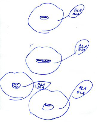
Bla bla bla
A recent reorganization uncovered this drawing from years back by my daughter Emma. If it was attached to a particular event or idea, I can’t remember (and neither does she). Too bad it wasn’t on hand when it was time to raft graphics for the Blunt design education conference. Upcoming conferences may contact me for licensing opportunities.
The Designer As…
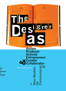
My work and words are featured in The Designer as…: Author, Producer, Activist, Entrepeneur, Curator, and Collaborator: New Models for Communicating by Steven McCarthy. The new book “provides an overview of the phenomenon of design authorship and interviews many international designers who have taken on different roles as authors or producers of their own projects.” I am one of 12 design figures interviewed specifically for the book, which also discusses and presents images of my exhibition Adversary: an exhibition (of) contesting graphic design, and the News of the Whirled magazine/novel project. An additional joy of the book is its design by Martin Venezky.
Transmission (Part 2)
Eight years later, the revision still stings logo connoisseurs. In “How to Ruin a Great Design” in the March 13, 2011 New York Times, design critic Alice Rawsthorn categorized it as a “crime against design.” “…UPS did this by replacing the wonderful “present” logo designed by Paul Rand in 1961, with a dispiritingly bland version devised by the global design group FutureBrand. The new logo is described on FutureBrand’s Web site as “a simplified dynamic curve” that expresses “the evolution of the company’s services and its commitment to leading the future of global commerce.” A waggish design blogger summed it up more succinctly as the “golden combover.” Each time I see it, I yearn for its predecessor.”
That “waggish design blogger” (D. Mark Kingsley) expressed his opinion on the (now defunct) Speak Up site, co-founded by designer, writer, and entrepreneur Armin Vit. (Note: others have claimed or been attributed as coiner of the term.) When I asked for his current take on the UPS remake, Vit—who now comments on corporate identity at the site Brand New—took a holistic view of branding, one with healthy elements of idealism and pragmatism: “I still hate the execution of the logo, but I have come to understand how necessary it was to get rid of Rand’s logo. It made business sense. It was strategic. It didn’t cater to the utopian Preservation of Classic Logos Society. It was a stab at the heart of nostalgia. But guess what? We all survived. Hundreds of corporate logos have changed since then and hundreds more will change. As long as the product or service doesn’t change, or changes for the better, we just have to adjust to the changing visual landscape. We can lament it, but that doesn’t move us forward.”
Designers overreach when calling down cultural or commercial calamity should prized public graphics be deleted from the landscape—or paltry ones be introduced. Ensuring the economic efficacy of particular signage and logos is impossible; too many unknown or uncontrollable factors are involved. As Vit indicates, logo redesigns can only be signifiers of a substantive change (and, we hope, improvement) in the product or service.
At the same time, culture matters—and not only to graphic designers. If society overall didn’t care about such concerns, designers wouldn’t exist. Faced with a potential aesthetic enhancement to the environment, why not have it? The problem, always, is individual taste…and what it transmits.
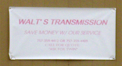
Were any of these considerations part of Walt’s deliberations when he changed his signs? The evolution was curious. The current sign, along with its casual placement, was stylistically odd. In its five lines of type, it managed to employ four different typefaces. “SAVE MONEY W/OUR SERVICE” it now advised, and that we should “ASK FOR ‘TWIN.’” Type was all CAPS—but in red, unlike the previous sign’s blue.
Rather than rely on any more speculation, I took the ten-minute walk to Walt’s to inquire about their signs. A young man left his work on a garaged vehicle to greet me and when informed of the reason for my visit, identified himself as Ulysses, the original sign’s artist. He painted it when he was in high school, indulged by his dad, “Walt.”
I expressed my admiration for his work and asked why it was displaced. The cause had nothing to do with aesthetics or a business plan. A customer that owned a sign store found himself unable to pay his car-repair bill. Rather than get stiffed, Walt took his payment in the customer’s product. This didn’t please Ulysses but he resigned himself to it. “You don’t argue with your pop,” he stated.
The sign was painted over and the yard cleared when Walt’s lost its business license. Ulysses and his brother had recently reopened the shop on their own. They acquired the current sign to announce their reopening and serve as a placeholder. With his brother deferring, Ulysses made plans for a new airbrush painted sign.
As we chatted, a young woman yelled to Ulysses from across the street, crossed, and joined us. He was obviously pleased by her attention, though he teased her about being over-demonstrative with her call. With the shift in his focus, I thanked Ulysses for his time, said I looked forward to his new creation, and moved on. He had a new audience and message to transmit.
After a couple a months, there was another change in signage, though not what my chat with Ulysses had led me to anticipate. The minimal tacked-up sign, now faded, had shifted position to adorn a small, garden shed-like building alongside the cinder block shop. This windowless structure had a single door in the center, over which was another sign stating “OPEN” and an arrow pointing toward the shop.
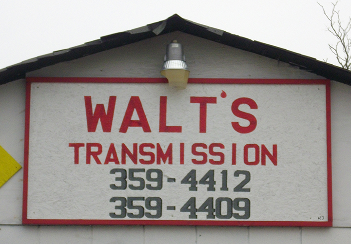
Occupying the space above the garage door was another homemade, wooden sign: red and grey painted letters on white background, obviously accomplished with a stencil—but with the gaps filled in. “WALT’S TRANSMISSION” stood over two phone numbers. No flourishes. Simple and functional.
Or was it? I found myself imparting a knowing, deliberate stylishness to the block lettering. And was that a hint of a drop shadow to the phone numbers? Below, for the signs “STRUTS” and “BRAKES” he hadn’t even bothered to go beyond the stenciling. Was I seeing a nuance, a design brut perhaps? Or did my admiration for the original sign have me attribute its maker an intentional aestheticization—one that didn’t exist?
Just as I may have been projecting my desire onto the sign, I may have additionally ascribed a flourishing of the business. The brothers seemed to be laboring every day of the week. A car or two or three always occupied the yard, awaiting or fresh from repair. My disappointment in not experiencing a dramatic new Ulysses creation was overridden by satisfaction that they were making a go of it. If business was steady, their current signage was successful. Post hoc ergo propter hoc, right?
Whatever prosperity I believed I witnessed abruptly ended, at least from my perspective. The garage door closed one day and I’ve yet to pass when it’s open, no matter the time of day or week. Then what few cars waited outside in the yard went away, as did everything that wasn’t a structure or attached to it. Once more, for whatever reason, the business seemed dormant—or dead. On occasion, a small pickup truck with “REPAIR” spray-pained on the side, and a hand truck, appeared outside the shack.
Though my previous speculations on the reasons for the sign changes at Walt’s were off base, I feel confident in my conjecture about what may be the last. Ulysses had priorities, and crafting creative signage wasn’t high amongst them. Just get something up there. The new sign was enough…until it wasn’t enough.
However, assigning any responsibility for the business’ fortunes onto the signage, especially considering the capricious routes to their crafting and installation, seems foolish, if not simply unfair. Some other cause may have shuttered Walt’s: one or the other brother falling ill, finding a better job, a falling out, a legal or licensing problem—any number of reasons. Maybe it’s another hiatus.
The signs were just carried along by circumstances, rather than directing them. They projected and were projected upon. Design gives, and receives.
