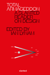
My essay “Singing the Surface” (which originally appeared in Print magazine and presented as a lecture in different venues) is included in the collection Total Armageddon: A Slanted Reader on Design, edited by Ian Lynam, and published by Slanted Publishers out of Germany.
Tag: critical writing
The Graphic Designer and Her Presence
It’s Jacqueline Casey’s world, we’re just living in (a reflection of) it.
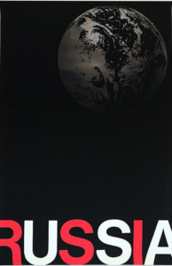
In the early 1990s, before ever envisioning a career in design, I spent months facing a framed copy of Jacqueline Casey’s 1985 poster Russia, USA Peace. It hung opposite my desk in the Massachusetts College of Art and Design Development office. Then I knew nothing about design’s history or Casey’s reputation. But the poster seemed to me ingenious and perfect—everything design was supposed to be.
The print came to the office via an exhibition of design alums I helped organize. At the opening reception, I chatted briefly with Jacqueline Casey. The show was my first exposure to her work and I expressed my appreciation to the frail, soft spoken woman. More than any other piece, or even her photo, when I look at Russia, USA Peace, I think of that short exchange of pleasantries. After all, she was in it, as was everyone on our planet.
The poster features a monochrome photo of Earth, shown in full in the upper right corner. Printed in a varnish, it floats in a black void that fills the poster’s frame. At the base of the poster runs the letters RUSSIA, the R and concluding A extending off the trim edges. The characters alternate in a solid, vivid red and reversed out white, which form USA.
Casey created the work for the exhibition Images for Survival organized by the Japanese Shoshin Society. The collection marked the 40th anniversary of the atom bombing of Hiroshima. At the time, a nuclear conflict between the two superpowers was the direst threat to humanity. Russia was then, technically, the USSR. Now, the poster seems prescient and timeless—both in appearance and message.
In all of Casey’s oeuvre, this work may be most emblematic of her method. She was the foremost U.S. practitioner of the International Style and deserves inclusion among its exemplars anywhere. While Müller-Brockmann is the style’s most renowned and doctrinaire practitioner, it was Casey that fully demonstrated its potential as an accessible design methodology. Müller-Brockmann may have generated the most music posters in the manner but it took Casey to make that style sing.
Casey represented an advance for the International Style separate from the “New Wave” represented by Wolfgang Weingart. (And it took another supremely talented American woman designer—April Greiman—to make that approach resound.) New Wave sought to bring down to Earth an airless typography (“do we live on the Moon?”). It didn’t make it breathe so much as make it hyperventilate.
In her process and product, Casey bridged the Swiss and American Modern strains: a fusion of the best Müller-Brockmann (discipline and structure) and Paul Rand (personability and formal imagination) could offer. She was the fulfillment of Modern intent, methodical and human.
High Modernist design overall developed from a celebration of mechanization and systemization. Its foremost performers operated sleek, clock-work devices of representation. Casey became the ghost in that machine.
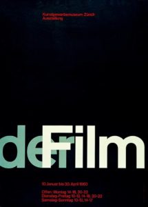 A comparison of Der Film and Russia, USA Peace is instructive. Both are signature works of the respective designers. The core aspect of each is a depiction of an effect of light: Casey using varnish, Müller-Brockmann an overlap that implies light projected through a transparency.
In this spot varnish, Casey engages the materiality of design, subtly. Müller-Brockmann is all about the ink that resides on the sheet’s surface. Material effects and manipulation: stock, die cuts, emboss, seem almost vulgar in his context. Casey’s usage is rare for her and typically restrained.
Staying true to the International Style’s formal fundaments, Casey infused it with an open, flexible sensibility. Müller-Brockmann’s design was an austere intellectual exercise, a distillation to craft a formal representation of a message’s “essence.” He pared to the pure. His favorite of his works was the blank verso of the printed sheet—this page ideally left blank.
Müller-Brockmann was ultimately unable to transcend language and its subjective confines. So, ironically, words became the primary, often sole, constituent of his works. For Müller-Brockmann, language was text, another formal element to arrange, along with image—ideally, usually, geometry—and color. Its role was limited to being positioned, scaled and read. That reading was singular and apparent.
With posters largely consigned to phenomena that could be reduced to names (activity, performer, venue) and dates, he self-selected the ideal forum for his essentialist art. The greatest challenge was overcoming the initial public reaction to his graphic austerity. Once normalized, the field was clear.
But it was Jacqueline Casey that fulfilled Müller-Brockmann’s promise, to divine and impart essential messages. She was able to summarize complex and arcane subjects using a limited but endlessly adaptable palette of effects. Overall, she orchestrated a wider range of topics, imagery, color schemes, graphic elements and compositions. Casey was a maximalist of the minutest.
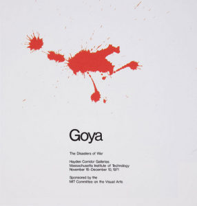
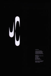
Her 1971 poster for the exhibition Goya: The Disasters of War is illustrative of her ability to realize a concise, evocative message. She condenses Goya’s paintings to an expressive, active spatter. It’s simple and readily recognizable, but also ambiguous, suggesting paint and blood equally. This is consistent with the many shapes that adorn Casey’s posters, forms that often toggle between representation and abstraction. The “JC” of the poster for an exhibition of her work is a deliberate, telling manifestation of this treatment.
Most importantly, Casey utilized language as a resonant, variable communication medium, beyond simply being text. Language’s manifold character wasn’t to be transcended but exploited. Müller-Brockmann’s design denied language’s nature, Casey’s embraced it. She would split words apart as if they were atoms, to reveal their component elements and spin off additional illumination. For instance, in addition to the nested RUSSIA/USA display, OIL is accented within POLLUTION for another poster.
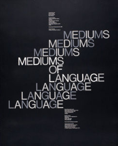
Variety in typeface was naturally found in heads and titles, though Helvetica still dominated. These texts could perform, reinforcing and representing the poster’s topic. At times, her typography approached concrete poetry in forming patterns and exotic arrays. Mediums of Language is a natural showcase of this impulse, where the occasional tool of repetition and stacking signals language’s structuring and multiplicity. Type becomes dimensional, a framework, multiplies, breaks apart.
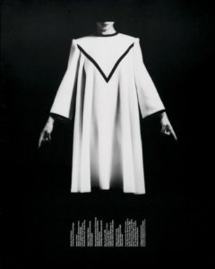
Casey regularly has more body copy in her posters than found in Müller-Brockmann’s. This is always set in a regular weight of Helvetica—exclusively set in ragged columns hung from their heads. Depending upon the overall layout, the columns may be horizontally spaced unevenly. Or, in Intimate Architecture, rotated 90 degrees to echo and extend the shape of the pleated dress hem.
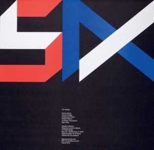
On the boundary of text and pure form are characters constructed from basic shapes, such as the ‘SIX’ of Six Artists. Characters are, of course, forms in their own right, though more charged and defined than the primary shapes—circle, square, triangle—that populate Casey’s posters.
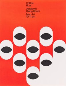
Casey employed a wide range of imagery as a regular component of her posters. She was willing to employ representation while maintaining a connection with abstraction. As previously noted, her abstractions frequently straddle the borderline with representation (the “cups” of Coffee Hour). At the same time, her abstract forms play different roles across works depending upon context: here symbolic, there pure geometry, elsewhere metaphoric.
Casey was also working with subject matter that while more diverse than that addressed by Swiss Internationalists, was still limited to focuses conducive to the minimalist approach. MIT wasn’t showcasing the broader hurly-burly of culture. The preponderance was art exhibitions, music performances and technology-related matters, where charts and graphs resided naturally. Though limited in topics, Casey wrung maximum meaning out of her reduced subjects and process.
Her achievement shouldn’t be cast only in contrast to Josef Müller-Brockmann and the International Style. Her work deserves regard within the entirety of design activity, historically and conceptually.
Though diffuse and amended, Modernist principles still permeate most of design practice. Many critical statements are often posed in relation or opposition to Modernism. Modern design still lives as design’s default position.
In this context, Casey’s work serves as an executive summary of our discipline, an ideal fig.1 textbook illustration of design’s most effective product. It’s design not at its most minimal but its most succinct.
BB King
If Barney Bubbles was punctuation, he’d be an interrobang. He seemed incapable of the straightforward, singular expression. Everything divulged layers. His work and practice were a gestalt of contradictions and oppositions. Unpacked, it opened like a graphic Big Bang. Even a personal scribble from Bubbles exhibits minutiae that provoke a close reading. Why would it be any different from the rest of his oeuvre?
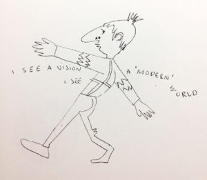
In his forward for Paul Gorman’s Reasons to Be Cheerful, designer Malcolm Garrett describes a message left for him by Bubbles, which included a rare self-portrait. “I SEE A VISION,” it read, “I SEE A ‘MODERN’ WORLD.” Crossing at chest level—ducking under the upraised left arm, floating over the extended right—the text precedes then trails after the sketchy figure. Even for a handwritten note, there’s typographic play: “WORLD” bends slightly, distinct from the rest of the text, the W hovering sideways above the O. “I SEE” repeats. Is it a stutter? Change of mind mid-thought?
The Bubbles caricature is moving away from the viewer, arms spread wide, fingers splayed. He might be maintaining balance as he confidently strides, left foot forward, right angled back, across an invisible tightrope or baseline. He could also be closing in to embrace someone off stage. Or be strutting. Or dancing.
There’s his signature schnoz, punctuated with a triangle and circle to form (according to Garrett) “Bauhaus nostrils.” Bubbles may not be seeing a “modern” world but smelling it, and liking the aroma. His mouth is described with pointed, puckered lips that betray no particular emotion or action. He could be silent, speaking, or singing.
The character is dressed in a geometric shirt or sweater, adorned with Charlie Brown-like zig zags at the elbows. Double-lined angles meet in the center of his back. Below, a curve of buttock is described to suggest snug-fitting trousers. Though likely dashed off, he still captures the detail of fabric bunched behind the bent right kneecap.
Bubbles deftly crafted an irreverent and expressive image of himself. Certain details stand out for their incongruency, complicating the reading. Springing from the top of his head, there’s what appears to be an unruly tuft of hair. He neglects to differentiate a shoe for the figure’s right foot as he does for the left.
With Bubbles, the game is always afoot, so intention and accident vie for cause. Usually, defects are revealed as effects. Bubbles’ work wasn’t so much designed as plotted, like a novel. The larger the seeming flaw—the “misprinting” of the This Years Model sleeve or the built in the scuff marks on Get Happy!!—the more purposeful he was.
Constantly manipulating aspects of identity, his penned persona is leading a double life. That spiky skull sprout isn’t just a coif, it’s a gimcrack crown. And that undivided ankle shows him to be wearing a costume—that of a jester. Yet again, Barney Bubbles has purposefully blended high and low, this time with him in the starring role. He’s his subject and Lord. The Fool King, or King Fool.
I see a “design” world conjured and ruled by Bubbles, the jester sovereign. He needed to create so prolifically, compulsively, in order to people that world. Its inhabitants were anthropomorphized combs, matches, handprints, paint splatters, typography, geometry, studio detritus.
He was a rare designer whose entire output—every ad, every sigil, every sleeve, every sticker—deserves delectation and preservation. Gorman’s monograph is a worthy document but doesn’t map the entirety of Bubbles’ domain.
He relentlessly churned out design artifacts: album packages, single bags, ads, buttons, stickers, posters, programs, and occasional books. Alongside these he crafted inventive videos, furniture, paintings, collages, sculpture. It was more than being prolific out of necessity, pushed by the breakneck pace of his primary clients. Its politics were a tad on the anarchistic side, though virulently antifascist.
Some designs were part of a wider system. A single sleeve might continue the layout aspects of the album it was drawn from—e.g. the single bag for “(I Don’t Want to Go to) Chelsea” and This Years Model—but this was an exception in Bubbles’ work. He seemed to regard it as slothful to extend an identity into other artifacts.
And within his album packages, there regularly were inner sleeves, bespoke labels (which could vary in design from one side to the other), postcards, posters, stickers. Many albums sported unique logos, or had the many variations for Stiff and F Beat. Bubbles also had his hand in illustrations and lettering—frequently wielding brush or stamp kit to create text. He should have been paid by the piece.
Bubbles production of countless supplementary, extraneous material was a hallmark of his profligacy. Within them, he didn’t simply rehash ideas, he developed themes across projects and media. Some sleeves contained more than one.
There was uncanny portrait Barney (Cycledelic, This Years Model, all Nick Lowe albums, The Future Now), painterly Barney (which includes most early works, Seconds of Pleasure, Imperial Bedroom, Compass Point), domestic kitsch Barney (Armed Forces front cover, Mad About the Wrong Boy), surreal saga Barney (25 Years On, Be Stiff EP, Frogs, Sprouts, Clogs and Krauts, Speak and Spell), quoting Barney (Almost Blue, Life’s a Riot with Spy vs. Spy), music vernacular Barney (Get Happy!!, A Case of the Shakes, Music on Both Sides), meta Barney (This Years Model, Do It Yourself). Broadening out to his overall logo designs, one theme emerges, that might best be described as regalia.
In his last years, Bubbles’ design for music increasingly referred back to the pre-1960s era of small, independent record labels catering to jazz, blues, R&B, and early rock and roll. It was a time when myriad upstart companies opened all over the U.S. that catered to local artists deemed problematic by the majors. (England’s smaller market was dominated more by their indigenous majors and so didn’t see the same flowering of labels until the punk/new wave era).
Bubbles’ designs mimicked the visual accents of these labels with often geometry-based graphics featuring demonstrative type in keeping with overall commercial packaging. Only occasionally did Bubbles pointedly quote a well-known indie source. Typographically mirroring the album Midnight Blue by Kenny Burrell (1963) on the famed independent jazz label Blue Note for Elvis Costello and the Attractions’ Almost Blue (1981) was Bubbles indulging in a double graphic pun. (A more slavish imitation was issued a few years later with Joe Jackson’s Body and Soul (1984) paying homage to 1957’s Sonny Rollins, Vol. 2.) Reid Miles’ expressive typography was a regular go-to template for numerous other sleeve designs.
Looking to the U.S. for popular music inspiration was an established sightline. Emerging from skiffle, British rock and roll owes its existence to American expressions. Even groups such as Fairport Convention, which drew from and electrified British folk songs, were inspired by the Byrds.
The dominant, declared evocation for British bands was blues and R&B. Groups like the Beatles and the Rolling Stones celebrated African-American artists (literally) ghettoized in the U.S. In their native country, these performers could only be found on small labels often named Regal, Imperial, Duke and King. Chess Records (originally called Aristocrat)—a major among the minors with a roster including Chuck Berry, Bo Diddley, Howlin’ Wolf and Muddy Waters—contained all of the nobility. (It was, of course, named after its founding brothers).
The U.S. embraced the symbolism of royalty to ennoble its musicians. Representational democracy is all that but being the President of Rock ‘n’ Roll doesn’t confer much glory. Maybe a Sinatra can carry “Chairman of the Board” and make it work. Senator of the Blues? Please. Elvis was the King. Aretha Franklin the Queen of Soul. And so on to Prince.
In a small irony, when Stiff Records released Mil Gracias A Todos Nuestros Amigos by Tex-Mex master Joe “King” Carrasco and the Crowns (1980), it didn’t come in a Bubbles sleeve, but was outsourced to Chris “C-More-Tone” Morton.
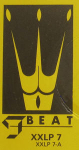
As Bubbles overall turned to referencing historic music graphics, regalia surfaced as a theme in his logo work. Alongside toggling between a couple of typography-based logos for F Beat, Bubbles established a three-pointed crown as the sole object-based mark. Perversely, he didn’t use it for the aptly-named Imperial Bedroom (1982) (or IbMePdErRoIoAmL, as Bubbles would set it), his last produced sleeve design for Costello. This was likely due to the crown’s appearance as logo on Trust (1980), two albums previously. By the time Costello got to King of America, Bubbles had abdicated from life.
Bubbles introduced a new theme with Get Happy!!—inhabiting album design’s past. Elvis Costello’s 1980 release marked his definitive break from a “brittle” new wave sound to adopting an overt soul and R&B template. Bubbles echoed this in his throwback design which fused day-glo new wave colors with a high contrast Reid Miles type vibe. Bubbles physically reinforces the retro move with partial lamination and the faux scuff marks (on the F Beat version).
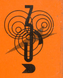
(Another dated reference is my suspicion that the sleeve may be a sham 3D image. According to Tom Pogson, his cover painting for Armed Forces was intended to be 3D. The idea may have slipped one release. The possibility is raised by the curious hues of the intersecting parallelograms on front and back. Also, the mysterious “bug” placed in the top corners front and back of the sleeve has a prominent “3” in its center, overlapping three sets of hypnotic concentric circles. The shape at the base of the “3” resembles a cap “D” with a pointed tail. A test viewing with 3D glasses was unsatisfying.)
Bubbles was as versed and discerning about the history of album graphics as he was in art. In addition to Reid Miles, Bubbles channeled record design pioneer Alex Steinweiss. Mostly, he evinced the music graphics “vernacular” (scare quotes used as they were performed by trained but usually uncredited professionals) prior to the 1960s, when his deliberate anonymity was the professional standard.
This theme didn’t dominate and was applied to other releases that invoked rock and country roots music. It generated a studied timelessness in Bubbles’ sleeve work, different in nature with his other pastiche motifs. Evoking fine art and album graphics dislocated Bubbles’ work from its specific date of manufacture.
The generalized reference to past album graphic styles replaced the overt quoting of high art sources. This is most evident in the transition from Armed Forces (actually, an amalgam of all of Bubbles’ themes) to Get Happy!!
Overall, with the entirety of his work, Bubbles was composing his own undeclared visual Lipstick Traces, drawing his own connections between music, art and design across history. The resulting diagram was like a spirographed circle. Bubbles wasn’t at the center, he was throughout.
That this theme came late and last in Bubbles’ career gives it a special poignancy, though there’s no evidence it held any for him. As noted, it was likely a pragmatic conceptual move, reinforcing and resonating with what was placed in the grooves. It was self-referential but reflexivity wasn’t new for Bubbles. It was upon returning to sleeve design at Stiff that a self-consciousness entered his work. The process of design and its artificiality became a constant, overarching subject.
His self-consciousness also manifested in questioning his relevance as a sleeve designer. As early as 1981, in his lone printed interview, he lamented being “staid and boring.” “I’ve got to get out,” he said, “It’s time for me to go.” Two years after the publication of that interview, Bubbles went.
I see a vision of a “post-modern” world where Barney Bubbles stuck it out longer. Maybe he’d still be with us even now, 76 years old, frail or hale. Following two designers he inspired, Peter Saville and Malcolm Garrett, he would have moved beyond full time sleeve design, and into other media.
But, like Saville with New Order, Bubbles would continue designing for musicians with who he had a special relationship. Hawkwind, naturally. He and Elvis Costello would get past the Punch the Clock rejection and continue their fruitful collaboration. Nick Lowe and Billy Bragg would also remain patrons. For them, Bubbles would even take on CD packaging, though he was indifferent to the format.
As his contemporaries Hipgnosis did, Bubbles would concentrate on video, overcoming his trepidation with the inability to manually edit and manipulate the medium. MTV and adventurous ad agencies provided him with a sufficient stream of clients seeking something surprising—and cost effective.
He was even able to branch out into documentaries and features, appreciated for his eccentric but affectionate take on British culture, politics, and domestic decor. It amused him to be shown on the BBC, because now it was where you see BB. He was still cagy about his name, dubbing his production company Fulcher Films.
He converted his Elephant Dollars film script (“a short film featuring rock’n’roll, but incorporating a love of trash movies, pulp sci-fi, bad true romance and the dumbest of humor. Its aesthetic is cheapness, surface flash and hipness”) into a series that gained respectable notices, particularly when aired on the American PBS network.
Vinyl came back, after a fashion. Bubbles returned to album art to joyfully launch into designing a round of commemorative box sets resplendent with new artwork and lavish companion books. There were no design credits.
Eye magazine still published Julia Thrift’s “In Search of Barney Bubbles” article in 1992. However, it came with a different slant and ending. The designer was agreeable to being interviewed about his “sordid past” but remained evasive and dismissive about his work. “King of the Bargain Bin!” he proclaimed himself.
Eventually, there was a documentary on Barney Bubbles, from a Fulcher Films protege. Rumor was that Bubbles actually directed it himself. Though photos were shown of the young Barney, the filmmakers substituted other, associated figures speaking Bubbles’ interview lines. These bogus Barneys were either silhouetted—sporting obviously fake noses—or friendly stand-ins with prominent proboscises, like Billy Bragg and Pete Townshend (to make up for the aborted Who Are You commission, the band hired Bubbles to package one of their myriad rarity collections). Each received a caption identifying them by a Bubbles pseudonym.
The biopic’s last scene featured Elvis Costello (identified on screen as “Declan McManus et al.”) casually handling a copy of My Aim Is True as he relates the story of Bubbles directing him through the cover photo shoot. Hanging on the wall behind Costello is the canvas of Snakecharmer & Reclining Octopus, the “Sal Forlenza” painting used as the cover of Imperial Bedroom.
Concluding the tale, Costello stops speaking for a moment to actually focus on the album cover. “Barney did all these letters individually, you know,” he then says, “the ones spelling out ‘Elvis is King.’ He may have spent more time on that than I spent on the music!” A beat. “That was Barney. He was King.”
The picture suddenly jumps, as if the film has leapt from its sprocket holes. In faulty magic marker, a scrawled word is then jerkily inserted into the frame: Fin.
Note: This is the fourth and concluding part of my study “Barney Bubbles: Offset Identities.” The previous episodes can be found in the “Writing” section. All the essays draw from Paul Gorman’s book Reasons To Be Cheerful: The Life and Work of Barney Bubbles (Adelita, 2010) for details and quotes about Bubbles’ life and work.
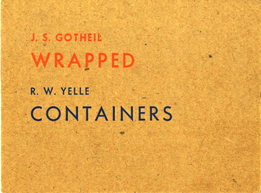
Article: Wrapped/Containers
This is my all-time favorite card design. Maybe it’s my favorite design, ever.
I’ve devised a number of gallery exhibition announcements over the years and I’ve always been determined to subvert the standard format. That plan is: full bleed color photograph of an artwork on the front, show information set in Helvetica on the back. Yawn. When mandated to follow this convention, I’ve inserted small eccentricities to break the tedium. It’s also design-strategic: my quirks may make the card stand out.
This is absolute when it’s been for a show of my own work. I first endeavor to disrupt the template for its own sake. But it’s then a response to reality: my work is such a mélange of artifacts that choosing a single piece would be unrepresentative. In any and every way possible I’ve tried to make the show card an artwork in its own right. Following the set pattern is an opportunity lost.
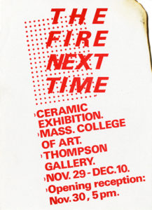
My contrarian notion was indulged early (1982) when I volunteered to design show cards for our annual major exhibitions when I was an undergraduate in Ceramics at Massachusetts College of Art and Design. Those days, my interest in graphic design pretty much began and ended with album covers.
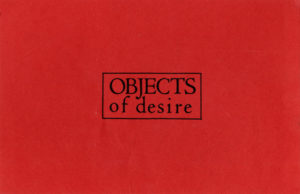
Both of my cards were painstakingly typeset with Letraset, channeling Peter Saville and an uneasy Malcolm Garrett/M&Co. fusion, respectively. Type-only art announcements weren’t uncommon but, to my eyes, they were all Modern literalness and didn’t engage typography’s potential. They didn’t have the same mystery and sophistication that Saville’s work evidenced.
My limited pride in my cards came from their simple existence. Aesthetically, I couldn’t see past my sources. Plus their stock made them feel insubstantial: a shiny red cover stock for the first, a lightweight heavy text for the latter.
It was in this context that I received the Wrapped/Containers card, which instantly crystallized my desires and became an exemplar. Thirty-one years later, I still cherish it and occasionally design-geek-out over it with students.
The enhancement this card brought was that it extended into materiality through its heavier, speckled, rough stock. It suggested and reflected dimensional objects by being sculptural in its own right. Modernist “truth in materials,” done right. However, it was the slight impression of the characters into the board that gave it its frisson. At the time, I had no idea how it was produced. If I ever had the chance to design a card again, I wanted to use the unique technique. It took me years to discover letterpress, which complicated matters.
Typographically, I still admire the subtle placement and scaling of the lines. Then there’s the quirky choice of complementary colors. All added up to a subtle subversion that may not have been intended. This ability to read into a work, to be invited in and construct meaning, is one I value highly. It’s more than the lack of detail which energizes the reading into—it’s the presence of the detail that is present.
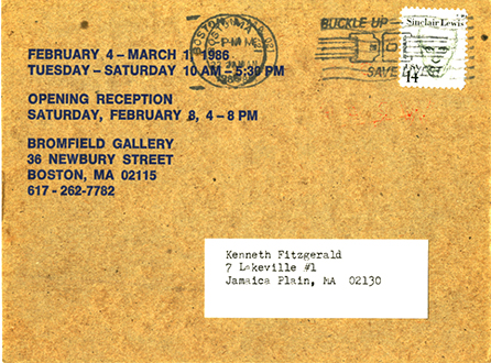
The verso is just as terse but sustains the enigmatic tone. Letterpress evidently wasn’t an option here and it goes offset. And too much pragmatic information must be imparted, limiting the potential. Yet it’s still styled and stylish: a typographer is absolutely at work—em dashes surrounded by spaces! The Helvetica is somewhat of a bum note but is ameliorated by the bolder font and setting. I suspect that Helvetica was all that was available. If so, the deft handling makes the best of a default non-option.
Meanwhile, something’s going on with that ‘phone number. The first hyphen gets spaced…but not the second. Typo? Don’t think so with something this succinct. How would someone otherwise so adept miss that? Unless someone else did the back. I take it to be the designer’s way of distinguishing the area code without resorting to the distracting shape of parentheses. The barbs above the cap line and below the baseline would visually disrupt the flush horizontal momentum of the text. Clever.
That artists’ names and show titles aren’t repeated is another restrained touch. Say something once, why say it again? The blue inking connects back with front despite the typeface change and avoids employing default black. The designer isn’t missing a trick: maximal impact from minimal moves.
That designer remains unknown. I may have considered going to the gallery and asking after a name. But I never even attended the show to my memory. Or if I did, I don’t recall the work. The card sticks with me, though.
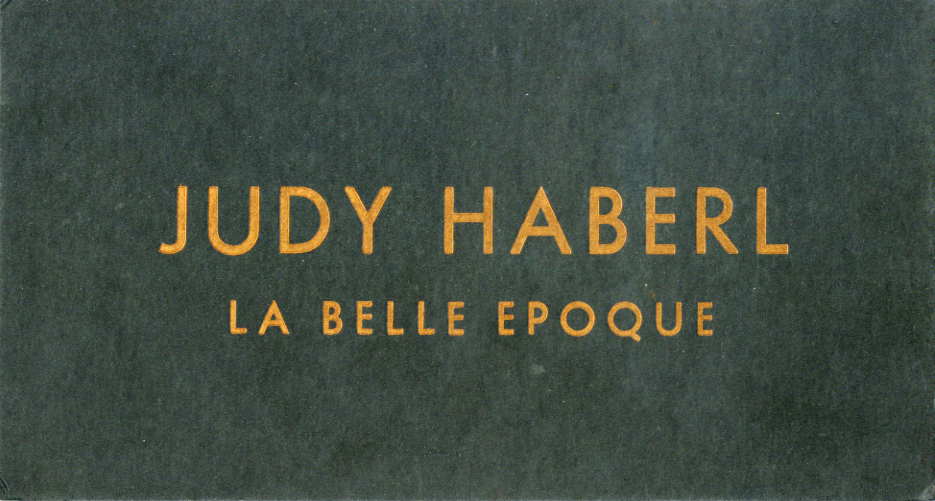
A possible coda arrived in my mailbox a few years later from another gallery. I instantly recognized the typeface and the impressed letters. Now, a flat, semi-gloss black stock, tendering metallic copper characters.
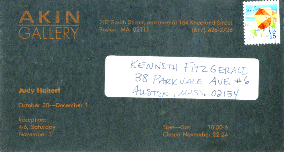
On La Belle Epoque, the artist gets prime hierarchical billing on the front. The reverse features a more distributed, active typography with what appears to be an attempt to relate to the front face with the use of Futura.
But the enterprise seems off, a poor sequel by clumsy student of the first. The front can hold up but not the back. Why those inconsistent alignments? The justified settings aren’t an inspired choice. And what’s up with the hyphens and em dashes? So long, ens, we hardly knew ye.
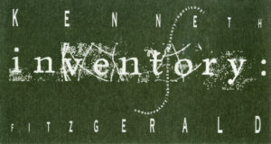
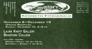
I was blind to these niceties then, so when I had my next opportunity to design my own show card, I spun off of the poor cousin. To its delinquencies, I added a host my own with a manic layout and typography that tries to do everything at once and delivers nothing.
“Moderation in all things, including moderation,” was one of my mottos (lifted from a John Gardner novel) and it was in full flower here. Another example of the wonders and/or abuses that early 1990s access to Mac desktop publishing made possible. Considering the times and that I was a fine-art-interloping, self-taught design dilettante, I could get credit for a peculiar style of restraint. You could read my card—if you spun it around a few times. Had I access to letterpress, it may have chilled me out some more.
While I secrete my ersatz offerings deep in the drawer, Wrapped/Containers is always on display and in easy reach. It clears space around itself and speaks boldly but softly. It’s provides a valuable lesson. On its own, nuance isn’t a developed design theory—but it’s always an aspirational attribute. Be real, be right.
