“When I went to art school, we were trained to be designers—if you could draw you became an illustrator; if you could just about draw, you became a designer; if you were just hopeless they would put you into exhibition display.” —Barney Bubbles, The Face, November 1981
There’s an astonishing quote residing on page 136 of Paul Gorman’s monograph Reasons to Be Cheerful: The Life and Work of Barney Bubbles—one that only graphic designers can fully appreciate. It’s in a brief anecdote that succinctly summarizes why the man born Colin Fulcher is the graphic designer sui generis. Non-designers reading the sentence would likely skim right over it, unaware of its import.
The subject is the proposed title for musician Elvis Costello’s third album; the speaker is Costello’s long time manager and label honcho Jake Riviera (once known as Andrew Jakeman). Bubbles had already designed Costello’s first two albums, as part of his role as lead designer at Stiff and then Radar Records. “Originally Elvis wanted to call it Emotional Fascism but Barney was totally against that, so it became Armed Forces.”
By this time in the book, Gorman has provided numerous examples of notoriously strong-willed reps and artists contentedly deferring to Bubbles’ judgment. That this instance stars the acid-tongued and headstrong former Declan MacManus is of no special import. (The degree of Bubbles’ disfavor, however, intensifies between editions of Gorman’s book; the first quoting Riviera that “Barney just didn’t like it”).
Costello himself relates a different, briefer account in his recent memoir, Unfaithful Music and Disappearing Ink, one that doesn’t necessarily contradict Riviera’s telling. “Accepting that no radio station would play a record called Emotional Fascism, the album was eventually titled Armed Forces,” writes Costello. While Bubbles isn’t explicitly given agency for the change (nor is anyone), the designer is immediately invoked in the next sentence: “It came wrapped in a folding envelope of Barney Bubbles’ pop art design.”
A simple swap of common for proper nouns illustrates what makes Riviera’s statement so astounding: “Originally the client wanted to call it X but the designer was totally against that, so it became Y.” That sentence, especially among designers, is unheard of. Usually, designers take what they get. At best, they might boast of swaying the client to a particular approach for the art. Even among designers famed for their association with particular labels, such as Reid Miles and Blue Note, Vaughn Oliver at 4AD, or Barbara Wojirsch of ECM, this type of influence is unprecedented. And for designers overall? That’s crazy talk.
In his book, Gorman’s fuzzy on exactly why Bubbles enjoys such favor. Multiple individuals who worked with the designer testify to his “genius.” It’s the last statement in the book, provided by Nick Lowe on why there’s a book in the first place: “Barney was the closest we’ll ever get to genius, we’ve got no choice.”
The constituents of Bubbles’ virtuosity, however, aren’t really articulated. This is unfortunately common with the majority of designer profiles. The subject’s superiority is regarded as self-evident—just look at the work. As rewarding as that is, the visual aspect is only one aspect of his facility. That Bubbles was provided unparalleled authority and latitude is established. However, what’s more significant and profound is what Bubbles did with his favor.
In terms of skill, he was virtuosic at everything he took on. Short of photography, he handled every possible aspect of realizing a graphic design piece. His illustrative proficiency in pen was matched by his painting, equaled with his collage. His typography was unerring and exacting in contemporary and historic styles, plus displaying a range of arresting emotions and evocations.
But it was in his conceptualizing, its acuity and comprehensiveness, that he remains unparalleled. In many instances, Bubbles went places with his work that designers—and definitely clients—wouldn’t think to go. Most wouldn’t recognize Bubbles’ endpoint as a potential destination. All the while, he was adhering to and espousing the fundamental, mundane commercial imperatives of graphic design and advertising. But rather than following the orthodox, predetermined route to a result, he truly started from zero, remaking design as he added on.
He was a riddler wrapped in a mystery inside an enigma slipped within a foot square cardboard folder. That’s the perception at the tone-arm’s-length distance between an LP sleeve designer and the record-buying audience. Though Bubbles had the freest of hands over content, he declined to draw attention to his role by setting it in type. Even though he sported an alias, Barney Bubbles eschewed a design credit, to this day making a full inventory of his work an ongoing venture.
It wasn’t, however, a striving for anonymity. It was a selective withholding that drew attention to itself. Bubbles toyed with ideas of identity and identification throughout his work. In this, as he was in all pursuits, Bubbles was fully invested. His design, his art, had no conceptual boundary. The design credit —and lack thereof—was an element of the design concept. That concept, and his art, extended outward and was ultimately his life.
As if one nom de design wasn’t enough, Bubbles inserted an additional layer of offset identity by employing an assortment of fanciful pseudonyms (“Big Jobs, Inc., Grove Lane, Sal Forlenza, Jacuzzi Stallion, Dag, Heeps Willard”) or cryptic designations (his VAT—tax identification—number on Get Happy!!) as identifiers. His mask donned masks; Bubbles existed as a Constructivist-decorated nesting doll.
The absent acknowledgements was another throwback move, much like the period styles and references Bubbles transmuted for his layouts. It was only in the late 60s, a few years before he began doing sleeve work, that it became customary for designers to be provided a credit. Skipping it was simply consistent on sleeves that graphically evoked the previous era.
By using alternate aliases, Bubbles showed his game wasn’t anonymity but evasiveness. Ironically, a further proof can be found in his use of “Barney Bubbles” in design credits. Prior to his joining the Stiff circus in 1977, spotting a variation of “Sleeve design: Barney Bubbles” wasn’t uncommon. While unusual in his graphics, he was conventional in noting his agency.
Personally and professionally, the punk era marked a transition for Bubbles. He pared down both his personal appearance—gone was the beard, long hair and wardrobe of his hippy days—and graphic approach (Gorman: “brutal cropping, stark isolation of images, gritty photo-play”).
However, while the “Barney Bubbles” moniker spanned these periods as his preferred personal identity (Gorman quotes Stiff staffer Suzanne Spiro: “As much as I got to know him, I never knew his real name and in a way I think it’s a shame it’s been revealed. If you asked him he would just shrug his shoulders and giggle”), its removal from the album credits was simply conceptual due diligence.
Even then, it was a porous barrier. Work outside the Stiff/Radar/F-Beat network might note: “Sleeve design: Barney Bubbles” (Clover, Unavailable, Polygram, 1977) or “Sleeve design and artwork: Barney Bubbles” (Dr. Feelgood, A Case of the Shakes, United Artists, 1980). Still, releases with Bubbles’ design such as Depeche Mode’s debut Speak and Spell (Mute, 1981), and The Psychedelic Furs Forever Now (CBS, 1982) only acknowledge their photographers.
When asked how he regarded his role in his lone published interview (The Face, November 1981) and why he shunned a credit, Bubbles’ answer would have made any old school Modernist design pro proud: “I feel really strongly about what I do, that it is for other people, that’s why I don’t really like crediting myself on people’s albums—like you’ve got a Nick Lowe album, it’s NICK LOWE’s album not a Barney Bubbles album!”
Practically, being dodgy about his credits had a deleterious impact on Bubbles’ professional career. As noted above, bands outside of his home base sought him out. This extended to superstar territory: in 1978, The Who’s management invited him to propose a design for Who Are You. (Bubbles’ concept of spelling the title out in power cables was rejected but adapted for the photo that was eventually used.) However, according to Paul Gorman, Bubbles shopped his portfolio in 1982 “to some of the bigger music labels, only to hear his unsigned work had already been claimed by others.”
Gorman documents other brushes with high-profile music-industry clients, showing Bubbles had visibility and credibility in the field. Aborted and unrealized projects go with the territory. Gorman also cites unnamed sources as speculating that Bubbles’ naming evasiveness was a tactic to avoid tax problems. If so, it was inconsistent—and ineffective.
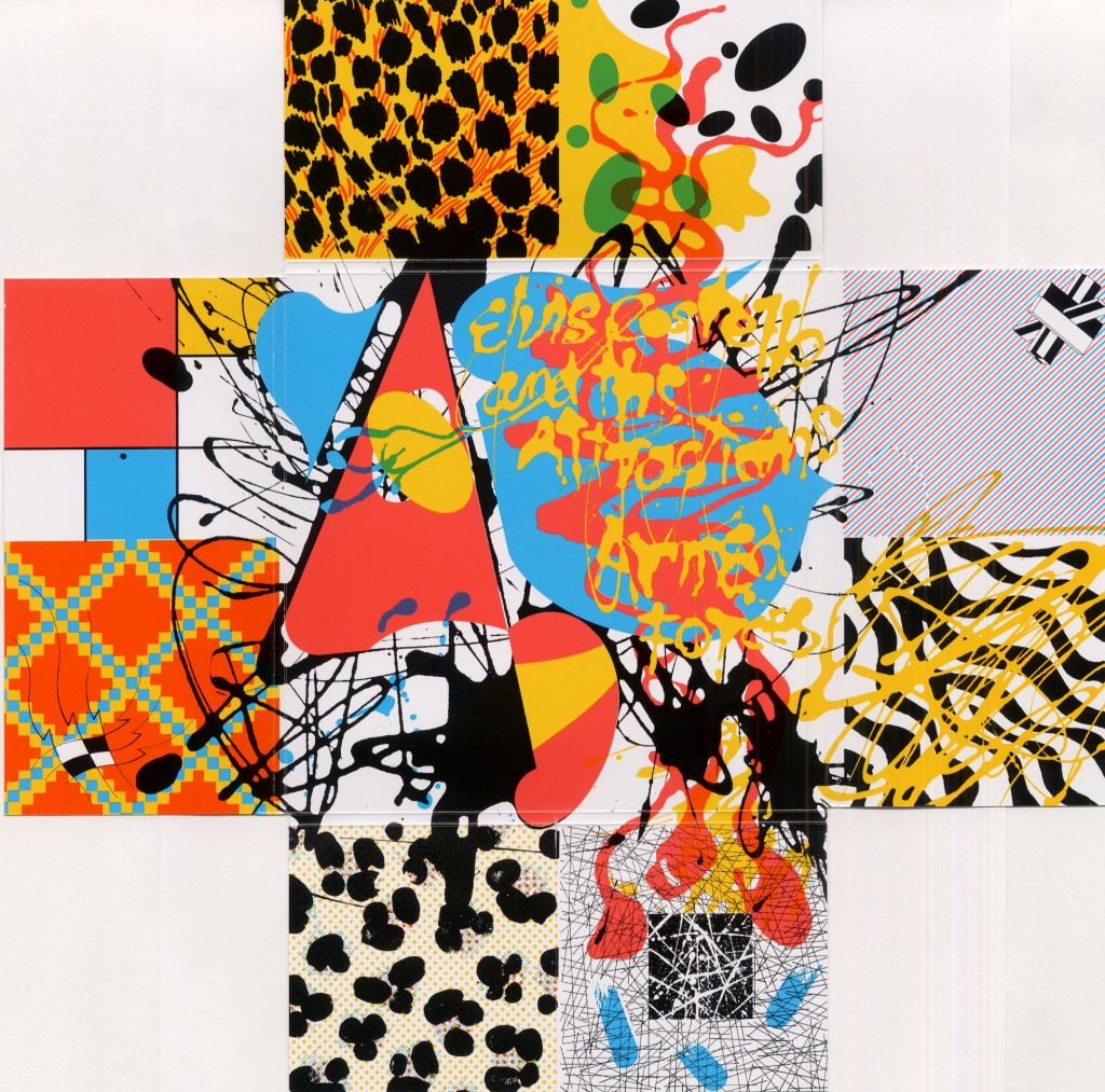
That Bubbles’ was engaged in a comprehensive gaming of identity is affirmed by his extension of the play into the graphics. In at least two prominent instances, Bubbles inserted fanciful self-portraits onto album covers. Right away, this is the ultimate audacity for a designer. The first example, considered a definite representation of his profile, is on Armed Forces—the record that Bubbles demanded and received a title change. He can be found in the abstract shapes to the left of the yellow paint splattered title “Elvis Costello and the Attractions Armed Forces.”
 In its original U.K. incarnation, this graphic is within the package, after unfolding the back flaps. The designer is literally behind the scenes on the album, embodied at the center of a mélange of high and low historical graphic styles. In a delightful irony, Columbia, Costello’s U.S. label at the time, evidently finding the U.K. cover unacceptable (a deliberately-kitsch painting of stampeding elephants adorned with discreet typography) made the inner splatter graphic the front image. Having rejected the designer’s preferred layout—probably as too British and obscure with tiny type—the company punished Bubbles by putting his grinning face on its cover.
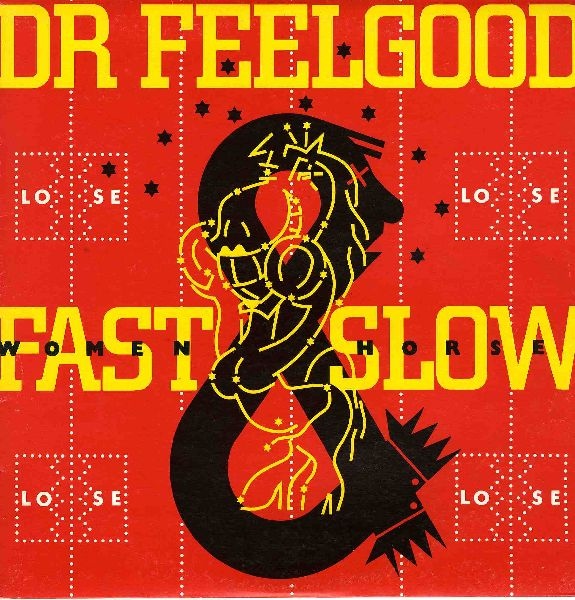
For the second—though Paul Gorman hedges that the image is possibly lead singer Lee Brilleaux—it would be in keeping if Barney Bubbles’ profile was again dead center on the illustrative cover of Dr. Feelgood’s 1982 album Fast Women & Slow Horses. Seeing stars after an implied punch from a buxom, boxing-gloved mare, the man’s face emerges from the top of a large black ampersand. If it’s Bubbles, he is again one with the artwork. He is (the) design. Another potentially sly reference is that as a designer, his role is an “&” to the musicians.

In adopting a creative guise—one evidently identical with his everyday semblance—he was in league with the musicians for whom he designed. Many adopted or were given stage names, especially at Stiff. Bubbles was back-stage named. Even if using their natal names, artists craft professional personas. These are carefully managed and strategically deployed. However genuine and real that singer seems, it’s a performance. Sincerity is how convincing you repeatedly enact intimacy with an audience.
Bubbles’ deep interest in the avant-garde art from the beginning of the 20th century also suggests a purpose. In her introduction of the catalog for National Gallery of Art’s 2006 exhibition Dada: Zurich, Berlin, Hannover, Cologne, New York, Paris, Leah Dickerman, Associate Curator of Modern and Contemporary Art at the National Gallery, writes, “Artists within the movement gave birth to a striking number of alter egos, which served as parodic, at times debased, inversions of a rational and authoritative masculinity.” Dickerman points to Duchamp’s “Rrose Sélavy” as the ultimate reversal with the artist changing sex.
Bubbles never ventured into this realm of invention; his pseudonyms were all masculine. His life/design still adeptly illustrated how identity is mutable. Individuality is a postmodern playground, not a fixed state. He did this through the panoply of bespoke logos he generated for Stiff and F-Beat—and with himself. Bubbles formed an identity that was composed of its antithesis: flux. He grasped intuitively the elements that make up graphic identity and handled them effortlessly. Along the way, he effectively branded musicians and labels.
Note: This is the introductory section of what will be an extended essay on Barney Bubbles that will further discuss his identity play in his logos, the clues provided by his album as “The Imperial Pompadours,” his influence on contemporaries such as Malcolm Garrett and Peter Saville, a comparison/contrast with Paula Scher (who worked at Columbia designing albums at the same time as Bubbles was working), his unique status exploring and exploiting the physical aspects of commercial print production, his fascination with regal imagery (“King BB”), and more!


